
The volatile nature of the Stock Market makes it the most fascinating field of interest. To understand this domain better, one needs to keep a constant eye on the everyday fluctuations. On the other hand, the charts and bar diagrams simplify this indulgent process for stock market enthusiasts who keep sharpening their skills with time. But for a layman, it is quite challenging to grasp the basics of knowing which chart tells the rise and which one depicts the fall. Especially if you are keen on learning about the financial market but know nothing about it, you have to pay extra attention to everything than a regular trading professional. Hence our SEBI Certified Research Analyst, Ashutosh Bhardwaj brings you ABC of basic charts of the stock market that you can study without much hassle if guided well by a professional like him. Before we begin with it, you need to have a basic clarity about what are these charts & patterns, and how you can benefit from them if you pay heed to the expertise of our industry veteran.
So What Are Charts in the Stock Market?
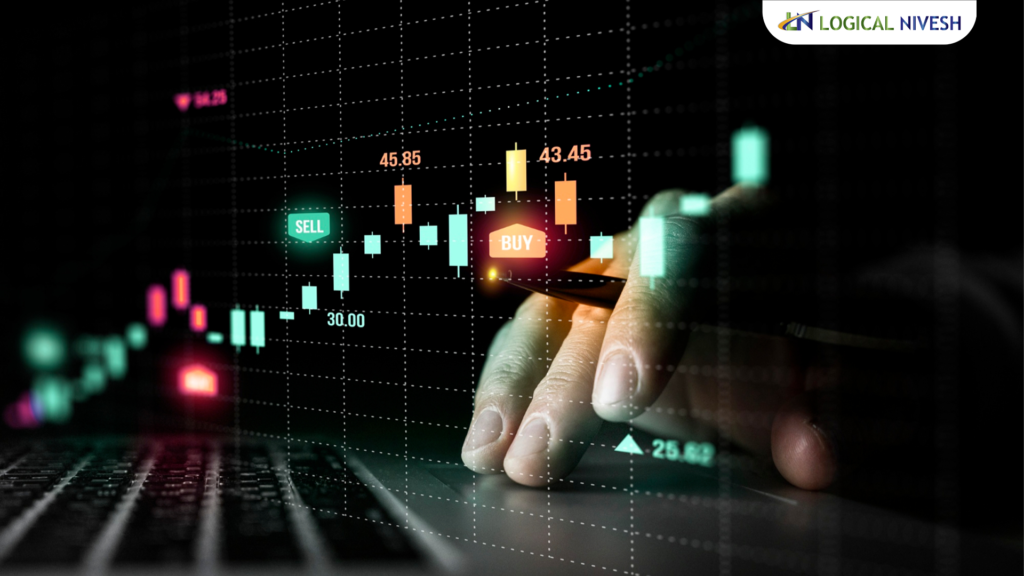
A chart in the stock market, or stock chart (if we put it that way), is a graphical representation of the stock prices that go up and down during a particular period of time. It doesn’t necessarily have to be a stock price, it can be any sort of investment of an asset that piques your interest. It could have different colours’ integration to depict the price fluctuation or something else like stock closing on that day.
Being the primary tools for technical analysis, charts play a crucial role for technical analysts who religiously follow these patterns with absolute understanding. They make the most of these visual representations of stock charts’ price fluctuations, as they scrutinise the historical market data of the given monetary means on a graph. The technical analyst can not only easily identify rare yet common price patterns but also devise future direction for their investment, leveraging the power of their trading knowledge.
Why Are Charts So Important?
After analysing a diverse range of stock charts to dissect market data, technical traders find out the best possible entry and exit plans for trading. Once you get the hang of chart analysis, you can speed up your process of accessing the data that you need for making lucrative trading decisions.
On the other hand, some traders prefer trading without referring to any chart or indicator for that matter, and they call it a “naked” trading approach. In other words, they make their trading decision based on the price action, market structure, and resistance levels instead of any pattern or data. It doesn’t mean the beginners can also take that risk. The naked trading approach is exclusively suitable for expert analysts. As a beginner, you should stick to the expertise of our SEBI-Registered Research Analyst.
Types of Stock Charts
Now, can these charts be bar diagrams, trendlines, or pie chart? Let us take a deep dive into this and identify some of the commonly renowned types of stock market charts.
1. Candlestick Charts
Thanks to Japanese native Homma, the inventor of the Candlestick Charts in the 1700s who, in order to determine the rice trader’s emotions in relation to its price, demand, and supply, developed a 4 dimension pattern consisting, the open, the high, the close, and the low. Today, after 300 years, every trade-intensive (or regular) economy is not just familiar with it but also rigorously following the 12 candlestick charts/patterns to make the most of this financial market.
It is a way of depicting the price movement of an asset in a graphical manner that shows the high, low, opening, and closing price of a stock in the form of a candlestick and its wick. The candlestick can be long, short, green, or red, depending upon the market sentiment towards the stock in question. This method simplifies the process of price interpretation for technical analysts.
2. Heiken-Ashi Chart
Heiken-Ashi is Japanese for “average bar”, which tells you when to stay in trade with an ongoing trend and when to make a smart exit when it doesn’t happen anymore, i.e., when the trend stops or pauses. As the trending market is an ideal place to bank on profits, there is a pressing need to predict the trends accurately with no room for error.
Being similar to Candlestick charts, people often confuse it as being one and don’t consider it as a separate unit. If truth be told, the Heikin-Ashi is a bar chart technique that is used with candlestick charts to give the best outcome. By doing so, the technical analyst can read the chart and pattern more easily and assess the trend without much hassle.
3. Renko Chart
Using price movement and not mapping it at regular intervals, the Renko chart looks like bricks are laid in a series of mountain structure. That is why it is also named so, inspired by the Japanese word, “Renga”, meaning bricks. It is way easier to use and interpret than candlestick charts where a lot of “noise” is used. Hence it comes in handy for identifying support and resistance levels in trading.
4. Point and Figure
Also renowned as P&F Analysis, it is usually exercised to envisage the movement of prices and trends in the market in an asset irrespective of the time that passes. The P&F charts make the most of columns that consist Xs or Os, denoting a prearranged amount of price movement, where Xs denote price rise and Os denote price fall.
5. Bar Chart
It is similar to candlestick charts, but very basic. It can show the same data as a candlestick chart but in another significant manner. They are not quite visual and are quite challenging to comprehend in one go. Whether to use a bar chart or a candlestick chart, totally depends upon the kind of information that is needed from the market data. The candlestick chart is ideal in case open and closed prices need to be studied. On the other hand, nothing can come at par with the bar chart if all the parameters have to be considered for making the analysis.
Conclusion
With a detailed analysis of all the stock charts, you can now easily make a sound financial decision that will get you the desired results in due time. To stay updated with the ongoing market trends and absorb every bit of the money market, stay connected with Logical Nivesh, your partner in trading and investment. Our SEBI-Certified Research Analyst, Ashutosh Bhardwaj will help you understand the nitty-gritty of the financial market, with ease.